But from the above formula it's clear that it's never the case that $x[n+1] = x[n]$. Therefore, saying that $x[n+1]$'s expected value is $x[n]$ is misleading — in the sense that a large number of people may expect the event $x[n+1] = x[n]$ to occur rather frequently.
Mathematical language may share words with daily usage, but the meaning can be very different.
----
Added Nov 27: In the random walk above, for any odd $k$, $x[n+k] \neq x[n]$. On the other hand, here's an example of a martingale where $x[n+1] = x[n]$ happens with probability $p$, just for illustration:
(Someone asked if it was possible to have such a martingale, which makes me fear for the future of the world. Also, I'm clearly going for popular appeal in this blog...)
Jony Ive is a great industrial designer, but Human-Computer Interaction is not Industrial Design. And some of the design decisions in recent hardware (meaning Ive's decisions) seem to ignore realities on the field. Take the latest iMac.
The new iMac doesn't have an optical drive; some pundits (and, I think, Phil Schiller on the Apple event) say that's a normal evolution. After all there aren't floppy disks on computers any longer and Apple was the first to drop them. And look how pretty the tapered edges of the iMac are.
Floppy disks existed as part of a computer-only ecosystem. CDs, DVDs, and BluRay Discs are part of a much larger ecosystem, which includes dedicated players and big screen TVs, production and distribution chains for content, and a back catalog and personal inventory for which downloads are not a complete alternative. (Some movies and music are not available as downloads and people already have large collections of DVDs and BluRay Discs.)
Using floppy disks as an example of change, implying that it is repeated with optical drives, shows a complete disregard of the larger ecosystem and willful ignorance of the difference between the earlier situation and the current situation.
For a laptop, the absence of an optical drive may be an acceptable trade-off for lower weight; for a desktop, particularly one that is a "home" desktop with a HD screen, the lack of a BluRay/DVD/CD drive is a questionable decision.
But look how pretty the tapered edges are, here in the uncluttered Apple Store retail shelves — oops, those computers will be in cluttered real world environments, where the necessary external drive (what, no BluRay drive yet, Apple?) will add even more clutter.
But, on the empty tables and antiseptic environments of "minimalist" designers' imagined world, that tapered edge is really important.
In the rest of the world, there are scores of people who like watching really old movies (available on DVD, not as downloads or streaming — except illegally), new movies in 1080p discs with lots of special features (i.e. BluRay discs that they can buy cheaply in big box stores), or their own movies (which they already own, and could rip — in violation of the DMCA — for future perusal, as long as they want piles of external hard drives); or maybe they want to rip some music that isn't available in download format, say CDs they bought in Europe that aren't available in the US yet.
So, using a decision that is not isomorphic at all (dropping the floppy disk) as a justification, Apple ignores a big chunk of the value proposition (consumption of media that is not available via digital download) on behalf of elegance. And, perhaps some extra iTunes sales — probably too small to make a difference on the margin.
What will this type of philosophy do to software? As Donald Norman wrote in this piece, there's nothing particularly good about fetishizing simplicity. Even now, many power users of Apple products spend a lot of time developing work-arounds for Apple's unnecessary rigid limitations.
Steve Jobs's second stint at Apple had the advantage of his having failed twice before (his first stint at Apple and NeXT), which tempered him and made him aware of the power of ecosystems (not just network effects). This is a powerful learning experience for an executive. Jony Ive hasn't failed in this manner.
A lot of people worry about "manufacturing jobs," but the metric is seriously flawed.
Politicians and some financial analysts decry the decline of manufacturing jobs. There has been some decline, but the way these jobs are measured is inherently flawed, as it fails to take into account the change in managerial attitudes towards vertical integration.
Easy to see why with an example:
Ginormous Corp. makes widgets. In the 60s to mid-80s, as it went from being Bob's Homemade Widgets to Ginormous Corp., it added new facilities which had janitorial, accounting, cafeteria, legal, and other support services. All personnel in these support services counted as "manufacturing jobs." In the mid-80s, Ginormous Corp. figured out (with a little help from Pain & Co and McQuincy & Co consultancies) that these support services were (a) not strategic and (b) internal monopolies. Part (a) meant that they could be outsourced and part (b) strongly suggested they should be outsourced. Let's say that Ginormous Corp. spun out these support services into wholly-owned subsidiaries, with no significant change in overall personnel. So, all the personnel in janitorial, accounting, cafeteria, legal, and even some of the technical business support went from being in "manufacturing jobs" to being in "service jobs" without any change to what actually is produced and any actual job.
A metric that can change dramatically while the underlying system and processes don't change much is not a good foundation for decision-making. "Manufacturing jobs" is one such metric, as it depends on organizational decisions at least as much as on actual structural changes.
I used to start my Product Management class with a couple of business math problems like the following: let's say we use a given market research technique to measure the value of a product; call the product $i$ and the value $v(i)$. We know -- by choice of the technique -- that the probability that the customer will buy $i$ is given by
$\Pr(i) = \frac{\exp(v(i))}{1 + \exp(v(i))}$.
My question: is this an increasing or a decreasing function of the $v(i)$?
Typically this exercise divided students in three groups:
First, students who were afraid of math, were looking for easy credits, or otherwise unprepared for the work in the class. These math problems made sure students knew what they were getting into.
Second, students who could do the math, either by plug-and-chug (take derivative, check the sign) or by noticing that the formula may be written as
$\Pr(i) = \frac{1}{1 + \exp(-v(i))}$
and working the increasing/decreasing chain rule.
Third, students who had a quasi-intuitive understanding ("grok" in Heinlein's word) that probability of purchase must be an increasing function of value, otherwise these words are being misused.
Ideally we should be training business students to mix the skills of the last two groups: a fluency in basic mathematical thinking and grokking business implications.
- - - - - - -
Administrative note: Since I keep writing 4000+ word drafts for "important" posts that never see the light of blog (may see the light of Kindle single), I've decided to start posting these bite-sized thoughts.
Or: it may look like brawn won the day, but it was really brains.
Yesterday I took some time off in the afternoon to watch the Blue Angels practice and the America's Cup multihull quarterfinals. Parking in the Marina/Crissy Field area was a mess and I ended up in one of the back roads in the Presidio. As I drove up, I saw a spot -- the last spot -- but, alas, there was a car in front of me. It drove into the spot, partly, then backed up and left.
I drove up to the spot and saw a block of cement with twisted metal bits in it, about three feet from the back end. I got out, grabbed the block, assessed its weight at about 100Kg, farmer-walked it to the berm, and got a parking spot.
Ok, so moving 100Kg or so doesn't make me the Hulk. What is my point, exactly?
There were at least two men in the car that gave up the space. They could have moved that block with ease. Instead they went in search of parking further into the Presidio; probably futile, if traffic was any indication. Why didn't they do what I did? Why didn't anyone before me (the parking areas well above the one I ended up in were already full as well)?
They didn't think of it.
Actually thinking is a precondition to problem-solving. Many problems I see are not the result of bad thinking but rather of the lack of thinking.
Cinema, especially documentaries, and the performing arts in general have a few useful lessons for presentations.
Of course, the main lesson regarding presentations is that preparation is key — just like with the performing arts. But this is a post about details rather than a rehashing of my big presentations post.
1. Have a script. A real script, like a movie script.
In the past I used the Donald Norman approach: have an outline, annotated with some felicitous turns of phrase (those work better if you figure them out in advance) and important facts and figures. But now I find that having a script is a great tool, even if I tend to go off-script early and often in a presentation:
a) It forces me to plan everything in detail before the first rehearsal. Then I can determine what works and what doesn't and adapt the script. (Just like in a movie production.)
b) It makes obvious when there's over-use of certain expressions, unintended aliteration, tongue twisters, and pronunciation traps. Not to mention embarrassing unnoticed double entendres.
c) It creates a visual representation of the spoken word, which lets me see how long some chains of reasoning are.
d) It serves as a security blanket, a mental crutch, especially when I'm lecturing in a language different from the one I speak all day at the lecture location (say, speak portuguese in Lisbon, listen to Puccini arias in italian, read Le Monde in french, and then have to capstone discussion classes with english lecturettes).
2. Explicitly write treatments on script
By writing the treatments (slide, board, video, interactive, prop, handout, demonstration, discussion, etc) explicitly into the script I can identify potential problems:
a) If there's a block of more than 750 words (i.e. about ten minutes) that has no treatments, it had better be an interesting story. If I think that the story could use some attention-grabbing treatment, I have time to figure out what to do as I write the script.
b) If there's a diagram on a projected material that requires several builds, and is marked as such on the script, I identify that as an opportunity for a step-by-step construction on the board. That change comes at a cost of production values (upon seeing my drawings, arts teachers suggested I follow a career in text- or numbers-based fields); the benefit is the physicality of the writing and the motion of the speaker. (Note: draw on board, turn, then speak. Even with a microphone, speaking into the board is bad practice, as the speaker cannot gauge the audience's reaction.)
c) By having a cue to the upcoming treatment, I can compensate for lag in equipment response. For example, in the script above I want the video to start as I finish my sentence "money can't buy taste or style." Given my equipment lag, I need to click the remote when I say "money" so that the words in the video follow mine without noticeable pause. (The pause would distract the audience, and direct some of their attention to the technology instead of the content. Obviously I don't say "let's see a video about that" or some such.)
d) Explicit treatments also make it easy to check whether I have all the materials ready and to make sure that I don't forget anything in the mise en scène before I start. (This is a particularly useful reminder to set up demonstrations and double-check props before the event.)
3. There's only one "take" on stage – so practice, practice, practice
The first practice talk is basically a check for design issues; many things that sound or appear adequate in one's mind ear or eye fail when said out loud, projected on a screen, or written on a board. After the first practice there's usually a lot of presentation materials rework to do. It goes without saying that failing to do this practice presentation means that the problems that would have been discovered during the practice will happen during the actual presentation – when it matters and in front of an audience.
A few iterations of this practice-analyze-rework (reminiscent of the draft-edit-redraft-edit- process for written word) should converge to a "gold master" talk. At this point practice will be for delivery issues rather than design issues: intonation, pronunciation, movement, posture, etc.
Full dress rehearsals, preferably in the presentation venue, are great tools to minimize surprises at the presentation time. I always try to get access to the venue ahead of time, preferably with the A/V people that will be there for the presentation.
If you feel ridiculous giving a full dress rehearsal talk to an empty room while the A/V people watch from their booth, just think how much more ridiculous it is to fail in front of an audience for lack of preparation.
(It goes without saying, but I said it before and will say it again, that practice is the last step in the preparation process before the presentation event; some presenters believe that practice can replace the rest of the preparation process, which is a grave error.)
4. Record and analyze presentations, even the practice ones
Given how cheap recording equipment is, there's no reason not to record presentations (except perhaps contractual restrictions).
The main reason for recording is quality control and continuous improvement; a second reason is to capture any impromptu moments of brilliance or interesting issues raised during the Q&A.
Depending on various arrangements and the presenter's approach to sharing, these recordings can also be part of the public portfolio of the presenter.
5. The Ken Burns effect - it's not a spurious animation
There are a few times when I have a few minutes worth of words that refer to or are supported by a photo. That photo is the projected material for those minutes, but I've started using very slow pans and zooms (the Ken Burns effect, after the PBS documentarian) to create a less boring experience.
My pragmatic guidelines for using the Ken Burns effect are:
a) Use sparingly: once, maybe twice in a presentation, and not in a row.
b) Very slow motion; the idea is to create a just-noticeable-difference so that there's something to keep the attention on the picture, but not enough to distract from what I'm saying.
c) The picture has to be high-resolution so that there's no pixelation.
d) In case of uncertainty, no effect. (Less is more.)
e) Since the photo supports the words I'm saying, and Keynote doesn't allow slide transitions in the middle of animations, the length of the effect has to be just short of the time it takes to say the words.
And a big difference from performing arts and documentaries: Every talk is new, even the canned ones.
Unless you're Evelyn Waugh, you don't want to give the same talk every time. Knowledge evolves, circumstances change, new examples appear in the media, and you learn new stuff from the question and answer period after a talk, or in the socializing period.
Having a script (and a master presentation a la Tom Peters) lets a speaker track the changes that a talk goes through over its lifecycle. It's an interesting exercise in itself, but also can give hints for how to adapt other "canned" talks one may have in one's portfolio.
Preparation, Practice, and Performance. Gee, it's like one of those management things where a complicated field is summarized by a few words that start with the same letter. But it's accurate.
He's right, in that Big Data doesn't necessarily lead to big money, but I think he exaggerates for pedagogical effect. Why he feels the need to do so is instructive, especially for Big Data acolytes.
Some days ago there was agitation in the Big Data sociosphere when an interview by Wharton marketing professor Peter Fader questioned the value of Big Data. In The Tech, Fader says
[The hype around Big Data] reminds me a lot of what was going on 15 years ago with CRM (customer relationship management). Back then, the idea was "Wow, we can start collecting all these different transactions and data, and then, boy, think of all the predictions we will be able to make." But ask anyone today what comes to mind when you say "CRM," and you'll hear "frustration," "disaster," "expensive," and "out of control." It turned out to be a great big IT wild-goose chase. And I'm afraid we're heading down the same road with Big Data. [Emphasis added.]
I think Pete's big point is correct, that Big Data by itself (to be understood as: including the computer science and the data analysis tools, not just the data -- hence the capitalization of "Big Data") is not sufficient for Big Money. I think that he's underestimating, for pedagogical effect, the role that Big Data with the application of appropriate business knowledge can have in changing the way we do marketing and the sources of value for customers (that is both the job of marketer and the foundations of business).
So, why make a point that seems fairly obvious (domain knowledge is important, not just data processing skills), and especially why make it so pointedly in a field that is full of strong personalities?
First, since a lot of people working in Big Data don't know technical marketing, they keep reinventing and rediscovering old techniques. Not only is this a duplication of work, it also ignores all knowledge of these techniques' limitations, which has been developed by marketers.
As an example of marketing knowledge that keeps being reinvented, Pete talks about the discovery of Recency-Frequency-Money in direct marketing,
The "R" part is the most interesting, because it wasn't obvious that recency, or the time of the last transaction, should even belong in the triumvirate of key measures, much less be first on the list.* [...]
Some of those old models are really phenomenal, even today. Ask anyone in direct marketing about RFM, and they'll say, "Tell me something I don't know." But ask anyone in e-commerce, and they probably won't know what you're talking about. Or they will use a lot of Big Data and end up rediscovering the RFM wheel—and that wheel might not run quite as smoothly as the original one.
Second, some of the more famous applications of machine learning, for example the Netflix prize and computers beating humans at chess, in fact corroborate the importance of field-specific knowledge. (In other words, that which many Big Data advocates seem to believe is not important, at least as far as marketing is concerned.)
Deep Blue, the specialized chess-playing computer that defeated Kasparov, had large chess-specific pattern-matching and evaluation modules; and as for the Netflix prize, I think Isomorphismes's comment says all:
The winning BellKor/Pragmatic Chaos teams implemented ensemble methods with something like 112 techniques smushed together. You know how many of those the Netflix team implemented? Exactly two: RBM’s and SVD. [...]
Domain knowledge trumps statistical sophistication. This has always been the case in the recommendation engines I’ve done for clients. We spend most of our time trying to understand the space of your customers’ preferences — the cells, the topology, the metric, common-sense bounds, and so on.
Third, many people who don't know any technical marketing tools continuously disparage marketing (and its professionals), and some do so from positions of authority and leadership. That disparagement, repeated and amplified by me-too retweets and Quora upvotes, is what makes reasonable people feel the need for pointedly making their points.
Here are two paraphrased tweets by people in the Big Data sociosphere; I paraphrased them so that the authors cannot be identified with a simple search, because my objective is not to attack them but rather illustrate a more widespread attitude:
It's time marketing stopped being based on ZIP codes. (Tweeted by a principal in an analytics firm.)
Someone should write a paper on how what matters to marketing is behavior not demographics. (Tweeted by someone who writes good posts on other topics.)
To anyone who knows basic marketing, these tweets are like a kid telling a professional pianist that "we need to start playing piano with all fingers, not just the index fingers" and "it's possible to play things other than 'chopsticks' on the piano." (Both demographics and ZIP codes have been superseded by better targeting approaches many decades ago.)
These tweets reflect a sadly common attitude of Big Data people trained in computer science or statistics: that the field of marketing cannot possibly be serious, since it's not computer science or statistics. This attitude in turn extends to each of these fields: many computer scientists dismiss statistics as something irrelevant given enough data and many statisticians dismiss computer scientists as just programmers.
That's a pernicious attitude: that what has been known by others isn't worth of consideration, because we have a shiny new tool. That attitude needs deflating and that's what Pete's piece does.
-- -- -- --
* An explanation of the importance of recency is that it's a proxy for "this client is still in a relationship with our firm." There's a paper by Schmittlein, Morrison, and Colombo, "Counting your customers," Management Science, v33n1 (1987), that develops a model of market activity using a two-state model: the purchases are Poisson with unknown $\lambda$ in one of the states (active) and there's an unobserved probability of switching to the other state (inactive), which is absorbing and has no purchases. Under some reasonable assumptions, they show that recency increases the probability that the consumer is in the active state. BTW, I'm pretty sure that it was Pete Fader who told me about this paper, about ten years or so ago.
It was the best of talks, it was the worst of talks.
(Yes, I understand that Dickens's opener has been used to the cliché limit; but the two examples I have in mind really bracket the space of possible talks. At least those talks with voluntary attendance.)
The best of talks: Michael Tilson Thomas at TED.
Even if you don't like art music, this talk is well worth watching for the presentation skills demonstrated by MTT:
MTT opens with a personal story of an interesting coincidence (his father's name was Ted); this is not my preferred type of opener, but he builds a personal narrative out of that opener and then merges it with his main topic very well.
MTT sits at a baby grand piano, which he occasionally plays to illustrate points about music evolution. This interactive production of the presentation material, similar to writing and running code or analyzing data in a technical presentation, has three main presentation advantages that make up for its risks:
1. Visual and physical variety, or more generally, presentation process variety. Every few seconds the image changes, the activity changes, the type of presentation changes: speaking, playing piano, describing a photo, narrating a video, watching a video without narration, listening to recorded music. Compare that with 18 minutes of speaking to slides bearing bullet points.
2. Clear demonstration of expertise, which projecting a video or playing recorded music cannot do. In a live demonstration or performance there's always a risk that something will go wrong, which is why many presenters avoid this kind of demonstration. But the willingness to take that risk is a strong signal to the audience of the presenter's competence and expertise.
3. Adaptability (not really used by MTT, since his was not a talk with audience interaction). This is particularly important in teaching technical material, I think: allowing the students to ask questions and see the answers come from the techniques that we're teaching them is a lot better than just showing them slides. (Of course real learning happens when the students do the work themselves, but this kind of demonstration helps begin the process and motivates them to act.)
The supporting materials were superbly chosen and executed. Credit here is due to a large supporting cast for MTT: this presentation uses materials and skills from the education and multi-media presence of the San Francisco Symphony, an organization whose main business is performing. But here are five important lessons that these materials illustrate:
1. No bullet points, and few words (mostly as subtitles for foreign language). The projected materials (including a large camera shot of MTT when no other materials are using the screen) are there to support what MTT is saying, not to remind MTT of what he wants to say.
2. The production values of the materials are professional (you can assess their quality on the 720p video) and that signals that this presentation is important to MTT, not something put together in the flight down, between checking email and imbibing airline liquor.
3. MTT's presentation never mentions the support, only the content: he doesn't say "this slide shows a photo of my father," he tells the story of discussing music with his father as the photo appears on screen. The photo is a support for the narrative instead of the narrative taking a detour to acknowledge the technology and the specifics of the material that is supporting it.
4. The interaction between materials, speech, and piano playing was choreographed in advance, with the video producer knowing which shots to use at each time. This comes from the extensive documentary and educational work of the San Francisco Symphony under MTT, but to some extent can be replicated by presenters of more technical material if they take the time to think of their presentation as a series of "cuts" in a video production.
5. It's not on the video, but it's obvious from the fluidity of the speaking, piano playing, and video materials that this talk was carefully planned and thoroughly rehearsed. That's not surprising: after all, a dress rehearsal is nothing new to a performing artist, and MTT clearly saw this talk as a performance. Most presenters would benefit from seeing their talks as performances (once they get the content part well taken care of, obviously).
The speech was well structured, with a strong opener and closer, repetition of the key points with different phrasing at the bridge points, and with the right mix of entertainment and education that is expected of a TED talk.
MTT had a teleprompter at his feet and notes on top of the piano, which in the video appear to include a couple of lines of music score, possibly as a reminder of the harmonic evolution he demonstrates at timecode 5:28 to 6:02. Many presenters are afraid that using speaker notes makes them look unprepared or "just reading their speech." This is an erroneous attitude for five reasons:
1. Expertise can be demonstrated in different ways, like MTT playing the piano. And as a general rule, the audience will have some idea of the expertise of the presenter, established ahead of time by other means.
2. Open discussion or question and answer periods allow the speaker to wow the audience with his or her ability to extemporize. (As a general rule, I suggest speakers prepare notes on some of the more likely questions that may need some thinking ahead, but not read them verbatim.)
3. Reading a speech is a difficult skill; most people can't do it correctly. Even when I write a speech for myself, I find that I also make notations on it and end up using it more as a psychological crutch than an actual speech to read. It's fairly obvious that MTT is not reading the speech verbatim.
4. Even if MTT is partially reading a prepared speech, it's most likely one that he had a big input in writing. Other than celebrities, politicians, and CEOs, most presenters will have written their speeches, and most audiences will expect that they did.
5. Ironically, many people who look down on unobtrusive speaker notes or teleprompters put their speaker notes on the screen as bullet points, confusing the materials that are there to help the speaker (notes) with the materials that are there to help the audience process the presentation (visual support).
The material MTT covers meshes with music history so he uses stories and storytelling as the main text form. Stories are one of the six tools for memorability the Heath brothers recommend in the book Made To Stick, and they work very well here. MTT also uses what Edward Tufte calls the P-G-P approach to exposition, presenting a Particular case first, then making a General point, then capstoning that point with another Particular example.
Dancing and singing aren't common techniques in presentations, but MTT uses them to great effect at timecode 2:24. In other presentations some acting or character impressions can be used for the same purpose: break the solemnity of the occasion, signal that you take the subject seriously but you don't take yourself too seriously, or to bridge topics.
(On a video that's no longer available online, John Cleese of Monty Python keeps interrupting his own presentation on creativity techniques with "How many X does it take to change a light bulb" jokes, as a way to give the audience breaks. And those jokes are part of a running arc that he established at the beginning of "there's no real training for creativity so I might as well spend my time telling jokes.")
Personally I don't recommend singing, dancing, or telling jokes in a talk unless you are a professional singer, dancer, or comedian, and even so only sparingly. Note that MTT did it for a very specific and memorable point: that a "piece of 18th Century Austrian aristocratic entertainment" turned into the "victory crow of [a] New York kid," and that's the atemporal power of music.
And as a closer, MTT rehashes the opening theme "what and how" and adds a cornerstone "why," ending on a good note and high energy. It's always important to have a strong closer, almost as important as a good opener.
Two minor observations:
1. MTT should have had a sip of water right before the talk and sloshed it around his mouth and lips, to avoid that smacking sound when he speaks. That sound is created by dryish areas in the mouth letting go at inappropriate times; sloshing the water solves it, drinking doesn't.
2. I assume that MTT's fleece was chosen to match his clothes and accessories, but he could have one custom-made in that color with the logo of the San Francisco Symphony. Maybe this is my crass commercialism rearing its ugly head, but with not flaunt the brand?
The worst of talks: a presenter who will remain anonymous at an undisclosed conference.
For clarity of exposition I'll call the presenter EF, for "Epic Fail," and use the pronoun "he" without loss of generality over gender.
EF started his presentation with a classic: computer trouble.
EF's talk was the last in a four-talk session; the other three presenters had installed their presentations in the podium computer during the break before the session, but EF did not. An alternative to using the podium computer would be to connect his laptop and test the setup during the pre-session break. A third possibility would be to connect his computer while the previous presenter was taking questions from the audience; personally I find this disruptive and avoid it, but it's better than what happened.
And what happened was that after four minutes of failed attempts to connect his computer to the podium (out of a total time per speaker of twenty minutes, including the Q&A period), EF asked the audience for a flash drive so he could transfer his presentation to the podium computer.
Presentation starts after six minutes of unnecessary computer-related entropy.
The room where this happened was an executive education classroom, with U-shaped seating, two projection screens side-by-side at the front and large flat screen TVs on the side walls so that the people on the straight part of the U could look at them instead of the front screens. These TVs also serve as a way for the presenter to see what's on screen while looking towards the audience.
Which is why everyone was puzzled when EF walked to one side of the front screens, turned his back to the audience and started talking in a monotone, while -- apparently -- clicking the remote at random. Really: he moved his slides up and down apparently at random and at high speed, maybe one-second on screen per slide, and without any connection to what he was saying.
But that's fine, because what he was saying was also disconnected within itself. In fact, I don't think he had any idea -- let alone a clear idea -- of what he wanted the audience to take away from the talk.
As far as I could gather, from reading the abstract about four times until I made some sense of it by writing a modal logic model of the essential words therein and crossing the 90% of words that were filler: there's a well-established phenomenon that is observable in a series of measures $X(p)$ as we vary the parameter $p$. The presentation was about changing the parameter space from $P_1$ to $P_2$, with $P_1 \subset P_2$. All tests in the literature concern themselves with the effects measured in $P_1$, and this paper tests the effects in $P_2$. This was not clear in the abstract or the presentation.
One of the slides that was on-screen several times, for about 4 seconds at a time, showed a table with the results from the literature, that is $X(p), p\in P_1$. Every time EF wanted to say something about these results, he moved several slides up and down, looking for the bullet point he wanted -- a point about the table that he had therefore removed from the screen. But that's not the worst.
After spending ten minutes explaining to an audience of experts in the subject matter a well-known point in the field of their expertise, EF glossed over details of his measurement technique, experimental procedure, and data processing, and presented his table of $X(p), p\in P_2$.
Without the $X(p), p\in P_1$ values for comparison.
Let me repeat that: he presented his results, which are to be compared and contrasted to the established results, on a separate table. Now, the phenomenon is well-established, but this is a table of numbers with three or four significant digits, so the details aren't that easy to recall. They are even harder to recall when EF keeps changing slides to look for bullet points about this table, again removing the table from the screen. Let me also point out that these are about 12 rows of 2 numbers per row, 4 with the comparison, well within the capacity of a one-slide table.
Every so often EF would stop abruptly in the middle of a sentence and silently move his slides up and down looking for something, then start a whole new sentence, without stopping the up-and-down movement of the slides.
But the clincher, the payoff after this painful exercise?
EF had no conclusions. His team was still analyzing the data, but so far it appeared that there was no change at all from the well-established phenomenon.
Now, in many fields, showing that a well-established phenomenon applies beyond the boundaries of the previous experiments is a valuable contribution. But in this case the expansion from $P_1$ to $P_2$ was trivial at best.
At this point, and about four minutes over time, EF invited the audience to ask questions. There were no takers, so EF asked one of the audience members (presumably an acquaintance) what he thought of some minor detail that EF had actually not talked about. The audience member said something noncommittal, and EF pressed the point, trying to get a discussion going. The rest of the audience was packed and ready to leave, but EF paid them as much attention during this failed attempt at a dialog as he had during his failed attempt at a presentation.
I was told later by another attendee that this presentation was not atypical for EF.
MTT is a performing artist, a showman by profession. The presentation he delivered was designed by a support team of graphic artists, cinematographers, writers: it fits within the education efforts of the San Francisco Symphony. MTT's audience is mostly there for entertainment and positively predisposed towards the celebrity presenter. His material is naturally multi-media, interactive, and pleasant, requiring very little effort on the audience part to process it. And, let's not forget, the presentation event itself was a team effort -- MTT is not operating the video screen or the teleprompter at his feet.
EF is a researcher and a professor. His presentation was designed by him, an untrained presenter (obvious from the talk), and delivered to an academic audience: hard to impress, critical, and possibly even hostile. His material is technical, dry, and requires significant effort (even in the best circumstances) to process and follow. He didn't have a teleprompter (though he could have speaker notes had he chosen to) nor a presentation support team.
So, yes, it seems that I'm being unfair in my comparison.
Except that there were, in that very same conference, three keynote speakers with equally dry, non-multimedia, hard to process material, who did a great job. They varied a lot in style and delivery but all made their points clear and memorable, kept their presentations moving along, and didn't use their projected materials as a crutch.
Above all, they had something interesting and important to say, they knew precisely what it was, and they made sure the audience understood it.
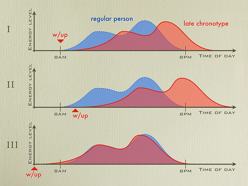
A late chronotype is someone whose energy level, after waking up, increases more slowly than than the average person's; also known as "not a morning person." Typically this slow start is balanced by high levels of energy in the evening, when other people are crashing. (Panel I below depicts this for illustration.)
Many late chronotypes believe that the solution to their problem is to sleep late. That is exactly the wrong approach. The problem of being a late chronotype is that our level of energy doesn't match everyone else's. Starting the day later only increases the problem (as illustrated in panel II).
The solution, which may sound counter-intuitive, is to get up much earlier than everyone else, therefore reaching peak energy at the same time as everyone else (as shown in panel III).
I have used a number of approaches to manage being a late chronotype (caffeine, no breakfast, exercise, ice-cold morning shower), but none was ever as effective as being on Boston time while living in California.
There's much to dislike about the current monetization of television shows, but bundling isn't necessarily a bad idea for the channels.
On a recent episode of The Ihnatko Almanac podcast, Andy Ihnatko, talking about HBO pricing and release schedule for Game Of Thrones (which he had blogged about before), said that a rule of commerce is "when customers have money to give you for your product, you take it" (paraphrased). I don't like to defend HBO, but that rule is incomplete: it should read "...you take it as long as it doesn't change your ability to get more money from other customers."
An example (simplistic for clarity, but the reason why HBO bundles content):
In this example HBO has three shows: Game of Thrones, Sopranos, Sex and the City; and there are only three customers in the world, Andy, Ben, and Charles. Each of the customers values each of the shows differently. What they're willing to pay for one season of each show is:
HBO can sell each of them a subscription for $\$150$/yr. Or it can price each show at $\$100$ and get a total of $\$100$ from each customer (any other price is even worse). This is the standard rationale for all bundling: take advantage of uncorrelated preferences.
By keeping the shows exclusively on their channel for a year, they get to realize those $\$150$ from the "high value" customers. After that, HBO sells the individual shows to make money off of people who don't value the HBO channel enough to subscribe (people other than Andy, Ben, or Charles above). This is standard time-based price segmentation.
This is not to say that HBO and other content providers won't have to adapt; but their release schedule is not just because they're old-fashioned.
First, there are 51 (of 860 total) posts with zero likes and zero tweets. This is important information: these are posts that no one thought worthy of social media attention. Unlike Causal Loop, I want to keep these data in my dataset.
Second, instead of a ratio of likes to tweets (or more precisely, an index based on a modified ratio), I'll estimate separate models for likes and tweets, with comparable specifications. To see the problem with ratios consider the following three posts
Post A: 4 tweets, 2 likes
Post B: 8 tweets, 2 likes
Post C: 400 tweets, 200 likes
A ratio metric treats posts A and C as identical, while separating them from post B. But intuitively we expect a post like C, which generates a lot of social media activity in aggregate, to be different from posts A and B, which don't. (This scale insensitivity is a general characteristic of ratio measures.) This is one of the reasons I prefer disaggregate models. Another reason is that adding Google "+1"s would be trivial to a disaggregate model -- just run the same specifications for another dependent variable -- and complex to a ratio-based index.
To test various hypotheses one can use appropriate tests on the coefficients of the independent variables in the models or simulations to test inferences when the specifications are different (and a Hausman-like test isn't conveniently available). That's what I would do for more serious testing. With identical specifications one can compare the z-values, of course, but that's a little too reductive.
Since the likes and tweets are count variables, all that is necessary is to model the processes generating each as the aggregation of discrete events. For this post I assumed a Poisson process; its limitations are discussed below.
I loaded Causal Loop's data into Stata (yes, I could have done it in R, but since the data is in Stata format and I still own Stata, I minimized effort) and run a series of nested Poisson models: first with only the basic descriptor variables (length, graphics, video, grade level), then adding the indicator variables for the authors, then adding the indicator variables for the topics. The all-variables-included models results (click for bigger):
A few important observations regarding this choice of models:
1. First and foremost, I'm violating the Prime Directive of model-building: I'm unfamiliar with the data. I read the Monkey Cage regularly, so I have an idea of what the posts are, but I didn't explore the data to make sure I understood what each variable meant or what the possible instantiations were. In other words, I acted as a blind data-miner. Never do this! Before building models always make sure you understand what the data mean. My excuse is that I'm not going to take the recommendations seriously and this is a way to pass the morning on Saturday. But even so, if you're one of my students, do what I say, not what I just did.
2. The choice of Poisson process as basis for the count model, convenient as it is, is probably wrong. There's almost surely state dependence in liking and tweeting: if a post is tweeted, then a larger audience (Twitter followers of the person tweeting rather than Monkey Cage readers) gets exposed to it, increasing the probability of other tweets (and also of likes -- generated from the diffusion on Twitter which brings people to the Monkey Cage who then like posts to Facebook). By using Poisson, I'm implicitly assuming a zero-order process and independence between tweets and likes -- which is almost surely not true.
3. I think including the zeros is very important. But my choice of a non-switching model implies that the differences between zero and other number of likes and tweets is only a difference of degree. It is possible, indeed likely, that they are differences of kind or process. To capture this, I'd have to build a switching model, where the determinants of zero likes or tweets were allowed to be separate from the determinants of the number of tweets and likes conditional on their being nonzero.
With all these provisos, here are some possible tongue-in-cheek conclusions from the above models:
Joshua Tucker doesn’t influence tweetability, but his authorship decreases likability; ditto for Andrew Gelman and John Sides. Sorry, guys.
James Fearon writes tweetable but not likable content.
Potpourri is the least tweetable tag and also not likable; International relations is the most tweetable but not likable; Frivolity, on the other hand is highly likable. That says something about Facebook, no?
Newsletters are tweetable but not likable… again Nerds on Tweeter, Airheads on Facebook.
As for Joshua Tucker's hypotheses, I find some support for them, from examining the models, but I wouldn't want to commit to a support or reject before running some more elaborate tests.
Given my violation of the Prime Directive of model building (make sure you understand the data before you start building models), I wouldn't start docking the -- I'm sure -- lavish pay and benefits afforded by the Monkey Cage to its bloggers based on the numbers above.
I've now watched a significant portion of Andrew Ng's Stanford Machine Learning course on iTunes U. I have taken several Machine Learning [classroom] courses, I've read many Machine Learning books and technical papers, I've done research on Machine Learning, and I've also taught Machine Learning. In short, I already know all the material in this course; watching it is mostly entertainment and professional curiosity.
And I still find the lectures harder to follow than a simple textbook.
(That's a lecture format problem, not a Andrew Ng problem.) The supplemental materials help, but they are essentially class notes in PDF format. (There are some problem sets, but no affordances for the general audience to get them graded.)
In lieu of, or to complement, this online course, here are a couple of non-interactive Machine Learning textbooks available online -- legally; posted by their authors:
Yes, an interactive textbook with Matlab (or Octave or R) programming affordances would be better than a non-interactive textbook, especially if the reader received feedback on his/her performance. But I still don't see the point of watching someone talk through the ML points when reading them is much faster. Video is useful when demonstrating software, for example, but a screen capture would work better than a classroom shot for that.
Let me reiterate the golden rule of learning technical material: 1% lecture, 9% study, 90% practice. You still need the textbook (preferably with dynamic content where applicable and programming and testing affordances) and the job of the instructor is crucial (selecting the material, sequencing it, choosing the textbook, designing the assignments, grading the assignments; and someone must write the textbook, of course), but the learning happens when you can WRITE CODE AND INTERPRET RESULTS.
If that's hard on your self-esteem, then tough. Machines don't care.
I've noticed that some smart people I know have different views of the world. Not just social, cultural, political, or aesthetic. They really do see the world through different conceptual lenses: mine are quantitative, theirs are qualitative.
Let's keep in mind that these are smart people who, when prompted to do so, can do basic math. But many of them think about the world in general, and most problems in particular, in a dequantified manner or limit their quantitative thinking in ways that don't match their knowledge of math.
Level 1 - Three different categories for quantities
Many people seem to hold the the three-level view of numbers: all quantities are divided into three bins: zero, one, many. In a previous post I explain why it's important to drill down into these categories: putting numbers in context requires, first of all, that the numbers are actual numbers, not categorical placeholders.
This tripartite view of the world is particularly bad when applied to probabilistic reasoning, because the world then becomes a three-part proposition: 0 (never), 50-50 (uncertain, which is almost always treated as the maximum entropy case), or 1 (always).
Once, at a conference, I was talking to a colleague from a prestigious school who, despite agreeing that a probability of 0.5 is different from a probability of 0.95, proceeded to argue his point based on an unstated 50-50 assumption. Knowing that $0.5 \neq 0.95$ didn't have any impact in his tripartite view of the world of uncertainty.
The problem with having a discussion with someone who thinks in terms of {zero, one, many} is that almost everything worth discussing requires better granularity than that. But the person who thinks thusly doesn't understand that it is even a problem.
Level 2 - Numbers and rudimentary statistics
Once we're past categorical thinking, things become more interesting to quantitatively focused people; this, by the way, is where a lot of muddled reasoning enters the picture. After all, many colleagues at this level of thinking believe that, by going beyond the three-category view of numbers, they are "great quants," which only proves the Dunning-Krueger effect applies.
For illustration we consider the relationship between two variables, $x$ and $y$, say depth of promotional cut (as a percentage of price) and promotional lift (as a percentage increase in unit sales due to promotion). Yep, a business example; could be politics or any social science (or science for that matter), but business is a neutral field.
At the crudest level, understanding the relationship between $x$ and $y$ can be reduced to determining whether that relationship exists at all; usually this is done by determining whether variation in one, $x$, can predict variation in the other, $y$. For example, a company could run a contrast experiment ("A-B test" for those who believe Google invented experiments) by having half their stores run a promotion and half not; the data would then be, say:
Sales in stores without promotion: 200,000 units/store
Sales in stores with promotion: 250,000 units/store
Looks like a relationship, right? An apparent 25-percent lift (without knowing the depth of the price cut I can't comment on whether this is good or bad). But what if the average sales for all stores when there are no promotions on any store is 240,000 units/store? All this promotion apparently did was discourage some customers in the stores without promotions (the customers know about the promotion in other stores because you cannot stop information for diffusing over social media, for example) and incentivize a few of the discouraged to look for the stores running the promotion.
(A lot of anecdotes used to support public policy make the sort of mistake I just illustrated. There are plenty of other mistakes, too.)
To go beyond the simple observation of numbers and to use statistical tests, we need to have some formulation of the relationship, for example a linear one such as:
$\qquad y = \beta \, x + \epsilon$.
This formulation includes a term $\epsilon$ (called stochastic disturbance) which is the modeler's admission that we don't know everything we'd like to. (All tests have an underlying structure, even non-parametric tests; when people say that there's no structure what they are really saying is that they don't understand how the test works.)
Given some pairs of observations $\{(x_1,y_1), (x_2,y_2),\ldots\}$ , the relationship can be tested by estimating the parameter $\beta$ and determining whether the estimate $\hat \beta$ is significantly different from zero. If it's not, that means that the value of $y$ is statistically independent of $x$ (to the level of the test) and there is no relationship between them -- as far as statistical significance is concerned.
There's a lot to argue about significance testing, some of which I put in this video:
Once we get past simple tables and possibly the prepackaged statistical tests that can be done on these tables -- almost like an incantation with statistical software taking the place of the magical forces--, few people remain who want to discuss details. But even within that small set, there are many different sub-levels of thinking.
Level 3 - Thinking in models and functions
Let's go back to the linear formulation in $y = \beta \, x + \epsilon$. What this means is that lift $y$ increases with price cut $x$ in a proportional way, independent of the magnitudes of each.
Ok, so what? ask a lot of people whose level of numerical reasoning is being stretched. The "what" is that the effect of a change of price cut from 4 to 5 percent is assumed to be equal to that effect of the change from 45 to 46 percent. And this assumption is probably not true (actually, empirically we have evidence that this is not true).
Many people are able to repeat the rationale in the previous paragraph, but don't grok the implications.
The questions of where we go from this simple model are complicated. Let us ignore questions of causality for now, and focus on how different people want perceive the importance of details in the relationship between $x$ and $y$.
Increasing vs decreasing. Almost everyone who gets to this level of thinking cares about the direction of the effect. At this stage, however, many people forget that functions may be monotonic (increasing or decreasing) over an interval while outside that interval they may become non-monotonic (for example, increasing until a given point and then decreasing).
Convex versus concave. Even when the function is monotonic over the interesting domain, there's a big difference between linear, convex, and concave functions. Some disagreements with very smart people turned out to be over different assumptions regarding this second derivative: implicitly many people act as if the world is either linear or concave (assuming that the effect of adding 1 to 10 is bigger than the effect of adding 1 to 1000). As I pointed out in this post about network topologies and this post about models, combinatorics has a way of creating convexities. There's also a lot of s-shaped relationships in the world, but we'll leave those alone for now.
Functional form. As I illustrated in my post on long tails, two decreasing convex functions (the probability mass functions of the Poisson and Zipf distributions) can have very important differences. Empirical researchers are likely to care more about this than theoretical modelers, but once we reach the stage where we are discussing in these terms (and the group of people who can follow and participate in this discussion) arguments tend to be solved by mathematical inference or model calibration. In other words, leaving personal issues and inconvenient implications aside.
(Needless to say -- but I'll write it anyway -- this is the level of discussion I'd like to have when consequences are important. Alas, it's not very common; certainly not in the political or social sciences arena. In business and economics it's becoming more common and in STEM it's a foundation.)
Elaboration is still possible. I'll illustrate by noting that underlying assumptions (that I never made explicit, mind you) can come back to bite us in the gluteus maximus.
(Non-trivial statistics geekdom follows; skip till after the next picture to avoid some technical points about model building.)
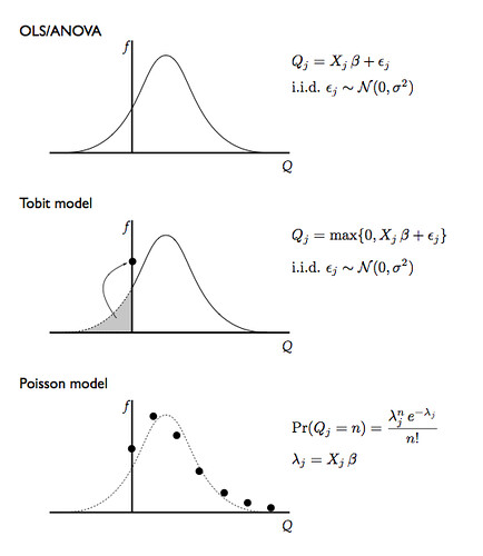
Let's assume that we collect and store the data disaggregate by customer, so that $y_i$ is the quantity (not lift) bought by customer $i$; after all, we can always make aggregate data from disaggregate data but seldom can do the opposite. How would we analyze this data?
First observation: expenditures per customer are greater than zero, always. But our model might predict, for some values of $\epsilon$ a negative prediction for $y_i$ times price (which is a positive number). So our model needs to be tweaked to take into account the hard bound at zero.
If ours were retail stores, where the data collected by the PoS scanners is only available for customers who buy something (in other words, we don't observe $y$ when $y=0$), we would have to use a technique called a censored regression; if we observe the zeros (like on a online retail site), then a model called Tobit will account for the pooling of the probability mass at zero.
Second observation: the number of units bought by any given customer is an integer; we keep treating it as a continuous quantity. Typically regression models and their variants like censored regression and Tobit assume that the stochastic disturbances are Normal variables. That would lead to possible $y_i = 1.35$, which is nonsensical in our new data: $y_i \in \{0,1,2,3,\ldots\}$.
Counting models, like a Poisson regression (which has its own assumptions) take the discreteness into account and correct the problems introduced by the continuity assumption. In olden days (when? the 50s?) these were hard models to estimate but now they are commonly included in statistical packages so there is no reason not to use them.
For illustration, here's what these models look like:
Conclusion - why is it so hard to explain these things?
Thinking quantitatively is like a super-power: where others know of phenomena, we know how much of a phenomenon.*
The problem is that this is not like a amplifier super-power, like telescopic vision is to vision, but rather an orthogonal super-power, like the ability to create multiple instances of oneself. It's hard to explain to people without the super-power (people who don't think in numbers, even though they're smart) and it's hard to understand their point of view.
Contrary to the tagline of the television show Numb3rs, not everyone thinks in numbers.
That's a pity.
-- -- -- --
* A tip of the hat to Dilbert creator Scott Adams, via Ilkka Kokkarinen's blog for pointing this out in a post which is now the opening chapter of his book.
Following every writer's advice on writing, which is to write often and about anything, I've been writing on my online scrapbook: from a short piece on sock strategy to a mid-sized piece on cargo pants to a large piece defending Apple to a series of pieces on digital content; that series spawned this post.
1. Digital content simplifies travel immensely
Comparing a packing list from 2000 to a packing list for 2012, I noticed that I now carry much less stuff and yet take much more content. But, in the post I originally wrote about this, I made the mistake of using the 2000 mindset to plan my 2012 content.
A single one-terabyte portable hard drive, smaller and lighter than one of the paperback scifi novels I carried in 2000, can take a vast library of music, podcasts, audiobooks, eBooks, television shows, and movies. I make sure that I take the content I want, then add as much as will fit.
Taking 200 eBooks, 100 audiobooks, 10 000 music tracks, and 300 videos, over one-hour each, for a four-week work trip might appear greedy -- especially since it's a work trip. But the point is that these represent options, not choices. While a choice is something you have to live with, an option is something you may use or not. And these are costless options, so no reason to not take them.
2. The economics of digital content create wealth for everyone
The free library one can build with iBooks, Kindle, and PDF from legal sources is comparable to some of the best libraries a wealthy person could own during the Gilded Age. Many technical books are also available as preprints from their authors.
There's a wealth of education and training opportunities available for free. For those who have no computers of their own, there are these buildings called "Public Library," which provide the computer and the internet access. This truly is an age of digital abundance.
So, when some technophobes start spouting nonsense like "the digital economy is broadening the chasm between the haves and the have-nots," all they're showing is their ignorance and a narrow focus on nominal dollars and who can buy the largest yacht or collectible $300 sneakers.
(This point is a special case of technological progress, which makes the lower middle class of 2012 much better off than those in the top 1% of income category in 1912 -- two words: modern dentistry, stealing from P J O'Rourke -- but the economics of digital content, namely negligible reproduction cost, make it an important special case.)
3. Changes to education due to digital content are overstated
First, there's the content side: learning how to program in R, for example. Motivated students can learn content from online sources; that's no surprise, since motivated students have always been able to learn from a precursor of online video textbooks (which is what lectures are): paper textbooks. And practice, of course, which may be tricky for some technical fields -- chemistry and nuclear physics come to mind -- but much less so for others. That's the one in "one and a half."
Second, there's certification of knowledge. Now that MIT decided that it would certify some courses for a small fee, that seems to be taken care of. But only in part (hence the "half"), since part of what the education system certifies in not purely content: getting to class (or at least labs) on time, performing consistently over long periods, in general doing things that one would rather not be doing. From a job market perspective, there's value in knowing whether a job candidate can do these things. Some people fret that education is more about fitting in than standing out, but for many jobs that's precisely what is desired of a new hire. This is part of the selection and screening made by education.
Third, there are skills beyond content that can only be obtained and observed in in-person interactions, like discussing and presenting, for example. Add to that the value of having a well-rounded foundation and, for technical fields, a problem-solving attitude. These are all things that can be observed in a few months on the job, but having an education institution do them first saves employers a lot of potential grief, especially if it's difficult to get rid of some people after you hire them (cf: Eurosclerosis).
Fourth, education institutions create networks of shared cultural values and experiences (observe the bonding between late middle age adolescents and late teenage adolescents at homecoming football games) and contacts, which are useful in later life. Networks on Facebook, Twitter, LinkedIn, Meetup, and Google Plus are useful for other purposes, but aren't complete replacements of a real social network. As in a network of people who have done things for each other.
Fifth, despite how much credentialism, nepotism, clique-ism, groupthink, and outright intellectual fraud can be laid at the foot of universities, for technical skills it's still the only really reliable source of information. The people who dedicate themselves to research in a technical field are forced to take multiple levels of abstraction into consideration (from the intro courses every researcher has to teach occasionally to the graduate seminars to the "where is this field going" moments of self-reflection) in their normal course of work. This perspective is uncommon in any other institution, and the only place where über-nerds of any field can be reliably found is the research institute or the university (where the nerds teach).
4. We still need to find a solution for the copyright problem
For all my love of open content and free software, and my loathing of the ridiculous means by which content providers hamper their own content and value proposition to get minor revenue enhancements, I have no illusions that content quality will be maintained without some protection of creators' rights.
Yes, anyone can write a book for a handful of dollars and some videos of cats playing piano have millions of views. But art photos that require travel or models, professionally recorded music (say the Berliner Philarmoniker doing a Beethoven symphony series), movies and television shows with good production values and actors, all of these cost a lot of money to make. And professional writers need to be paid -- some of them don't want to rely on public speaking or other non-writing forms of revenue. They want to write for a living. Some free content may be very good, but that mostly is paid for in some other way -- like the aforementioned free preprints of technical books. In general, good stuff means expensive to create, despite how cheap it may be to reproduce.
I for one don't want future Hawaii Five-O seasons to be fan-fic, amateur-made video snippets with Comicon rejects playing Grace Park's role.
So, I'm fine with buying the DVDs, especially since I like to listen to the commentary tracks; I find it ridiculous that ripping them with Handbrake would be a violation of the DMCA, even if I did so just to watch movies I own on my iPad. (Many DVDs now come bundled with a digital copy to appease people like me who are -- mostly -- on the side of content creators but find the revenue model intromissions in the consumption almost worthy of a switch to the content pirates side.)
A bonus point: I trust the cloud, but only as a last-resort back-up.
My work content is divided into three priority levels: Crucial, Important, and the rest. All work content is on the laptop hard drive, backed up on the portable hard drive. (All the entertainment content mentioned in point 1 is on the portable hard drive too, with the content I think I really want to consume during the trip on the laptop, the iPad, and the iPod Touch as well. Obviously these aren't the only copies I have of that content.)
Important content, about 11GB of class materials, is also backed up on four 16GB flash drives: two in my pockets, one on the laptop bag, and one in the rolling carry-on.
Crucial content, about 1GB of class materials (handouts, notes, essential images) and 500MB of research-in-progress (papers, notes, computations, code, experimental data) also goes on those 16GB flash drives plus two older 2GB drives and is backed up on DropBox and Amazon Cloud Drive.
Someone told me the 3-2-1 theory of backups: three copies, two formats, one off-site. I think the Many-Many-Many approach is better. And the cloud, that's all fine and dandy, but I want a local copy. For luck, say.
Power law (Zipf) long tails versus exponential (Poisson) long tails: mathematical musings with important real-world implications.
There's a lot of talk about long tails, both in finance (where fat tails, a/k/a kurtosis, turn hedging strategies into a false sense of safety) and in retail (where some people think they just invented niche marketing). I leave finance for people with better salaries brainpower, and focus only on retail for my examples.
A lot of money can be made serving the customers on the long tail; that much we already knew from decades of niche marketing. The question is how much, and for this there are quite a few considerations; I will focus on the difference between exponential decay (Poisson) long tails and hyperbolic decay (power law) long tails and how that difference would impact different emphasis on long tail targeting (that is, how much to invest going after these niche customers), say for a bookstore.
A Poisson distribution over $N\ge 0$ with parameter $\lambda$ has pdf:
A discrete power law (Zipf) distribution for $N\ge 1$ with parameter $s$ is given by:
$ \Pr(N=n|s) =\frac{n^{-s}}{\zeta(s)},$
where $\zeta(s)$ is the Riemann zeta function; note that it's only a scaling factor given $s$.
A couple of observations:
1. Because the power law has $\Pr(N=0|s)=0$, I'll actually use a Poisson + 1 process for the exponential long tail. This essentially means that the analysis would be restricted to people who buy at least one book. This assumption is not as bad as it might seem: (a) for brick-and-mortar retailers, this data is only collected when there's an actual purchase; (b) the process of buying a book at all -- which includes going to the store -- may be different from the process of deciding whether to buy a given book or the number of books to buy.
2. Since I'm not calibrating the parameters of these distributions on client data (which is confidential), I'm going to set these parameters to equalize the means of the two long tails. There are other approaches, for example setting them to minimize a measure of distance, say the Kullback-Leibler divergence or the mean square error, but the equal means is simpler.
The following diagram compares a Zipf distribution with $s=3$ (which makes $\mu=1.37$) and a 1 + Poisson process with $\lambda=0.37$ (click for larger):
The important data is the grey line, which maps into the right-side logarithmic scale: for all the visually impressive differences in the small numbers $N$ on the left, the really large ratios happen in the long tail. This is one of the issues a lot of probabilists point out to practitioners: it's really important to understand the behavior at the small probability areas of the distribution support, especially if they represent -- say -- the possibility of catastrophic losses in finance or the potential for the customers who buy large numbers of books.
Amazon and the Kindle have killed the bookstore. Why? Because people who buy 100 or 300 books a year are gone forever. The typical American buys just one book a year for pleasure. Those people are meaningless to a bookstore. It's the heavy users that matter, and now officially, as 2009 ends, they have abandoned the bookstore. It's over.
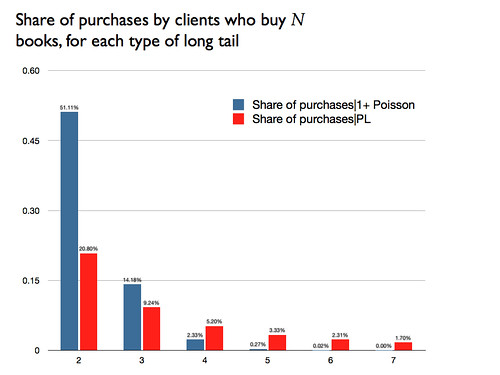
To illustrate the importance of even the relatively small ratios for a few books, this diagram shows the percentage of purchases categorized by size of purchase:
Yes, the large number of customers who buy a small number of books still gets a large percent of the total, but each of these is not a good customer to have: elaborating on Seth's post, these one-book customers are costly to serve, typically will buy a heavily-discounted best-seller and are unlikely to buy the high-margin specialized books, and tend to be followers, not influencers of what other customers will spend money on (so there are no spillovers from their purchase).
The small probabilities have been ignored long enough; finance is now becoming weary of kurtosis, marketing should go back to its roots and merge niche marketing with big data, instead of trying to reinvent the well-know wheel.
Lunchtime addendum: The differences between the exponential and the power law long tail are reproduced, to a smaller extent, across different power law regimes:
Note that the logarithmic scale implies that the increasing vertical distances with $N$ are in fact increasing probability ratios.
- - - - - - - - -
Well, that plan to make this blog more popular really panned out, didn't it? :-)